Minnesota Bioinnovation Accelerator Web Design
Client: Minnesota Bioinnovation Accelerator (University of Minnesota)
Project lead & client management: Matogen Digital
Design: Unfold
Webdesign: Matogen Digital
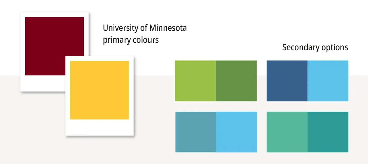
Working within strict brand guidelines does not have to feel limiting. When approached thoughtfully, those boundaries can become the foundation for something distinctive and meaningful. We have worked within university branding standards before, but for the Minnesota Bioinnovation Accelerator (MnBA), part of the University of Minnesota’s Research and Innovation Office, we pushed those boundaries just enough to create an identity that feels uniquely theirs.
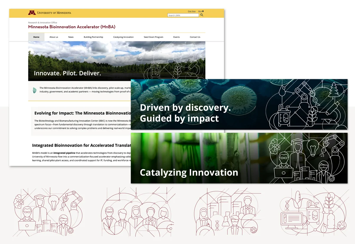
Our scope included developing a logo icon, selecting a custom secondary colour to complement UMN’s palette, designing an icon set and infographic, and creating website layouts and banners.
Logo Icon
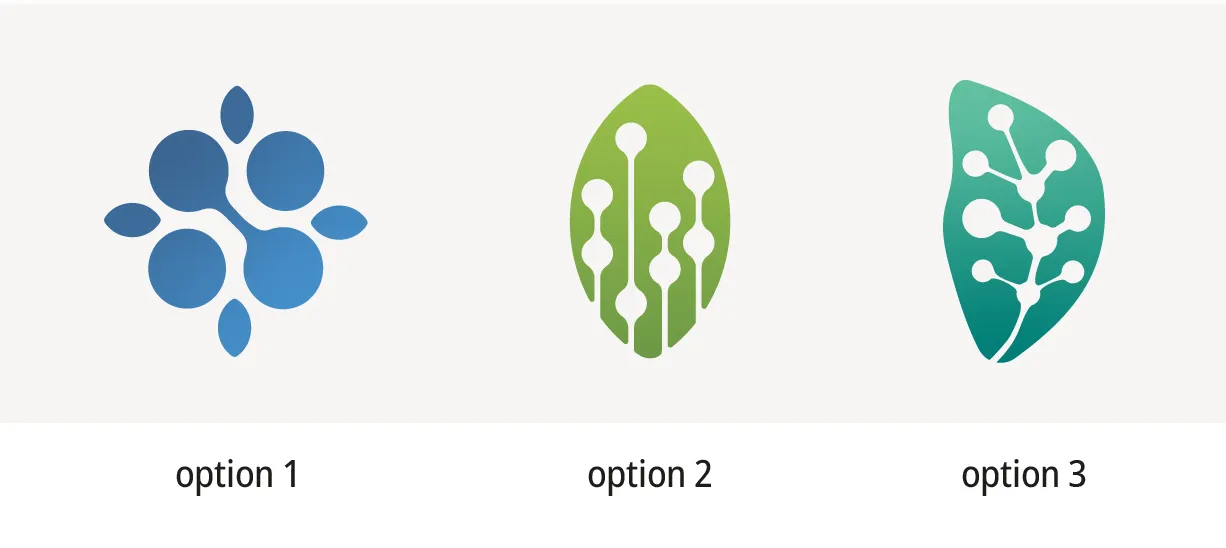
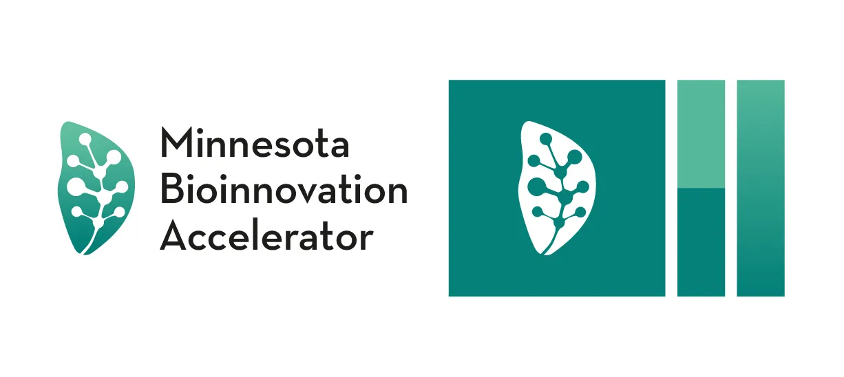
MnBA needed a compact, versatile mark that reflected their mission while aligning seamlessly with UMN’s official branding. We explored forms inspired by chemistry and biology, developing their signature colour alongside the icon. The final direction, option three from our initial concepts, introduced a subtle green gradient that adds depth and is now visible across their digital presence.

Icon Set
Translating complex concepts such as biomanufacturing, biotechnology, and sustainability into clear visual language required careful thought. We developed a line-style icon set placed over circular yellow backgrounds to create consistency across the brand. Layered, overlapping elements give the icons a distinctive style, while keeping them legible at any scale. A complementary green set was also created for use in presentations.





























Infographic
MnBA needed a way to explain their integrated pipeline model so users could quickly understand the process. Because infographics often struggle on mobile devices, we designed with cross-platform usability in mind from the outset. Inclusivity also shaped our approach. The illustrations intentionally represent people from diverse cultural backgrounds and genders.

Website Design
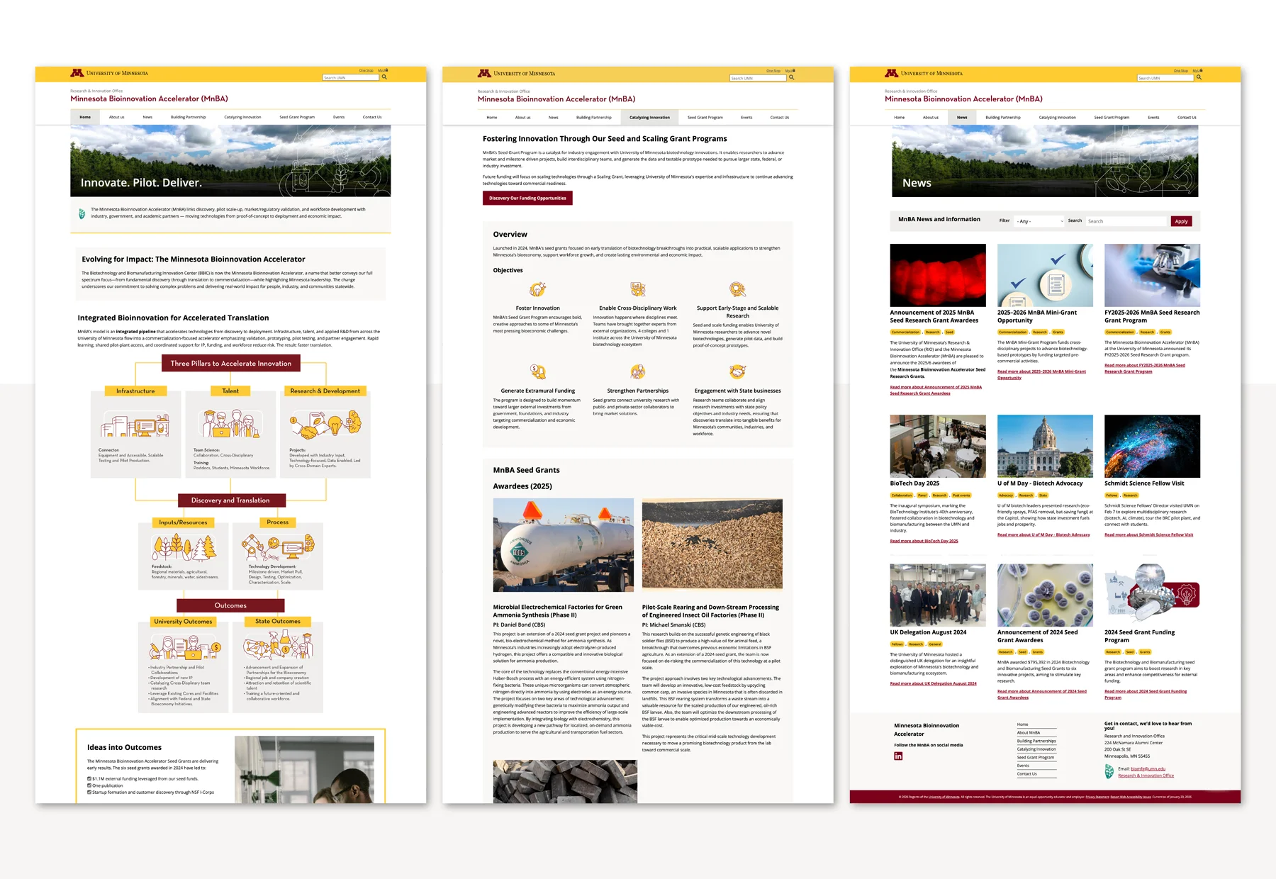
Working closely with Matogen Digital, we carefully mapped out how to work within UMN’s guidelines while creating page designs that feel distinctly MnBA. We developed multiple layout options, including one-, two-, and three-column configurations, giving the team flexibility to integrate imagery within content blocks. This adds visual interest and improves readability across different types of information.
Website Banners
Each page features a custom banner that layers illustration over photography to communicate the page theme. The illustration style mirrors the icons and infographic, creating strong visual consistency across MnBA’s brand. This approach allowed us to develop something distinctly theirs while remaining aligned with UMN’s overarching brand standards.
All deliverables, including icons, infographics, and banners, were designed to be versatile and easy to use across presentations, digital platforms, and print materials. We delivered a complete asset package at project completion, and the client was happy with the outcome.