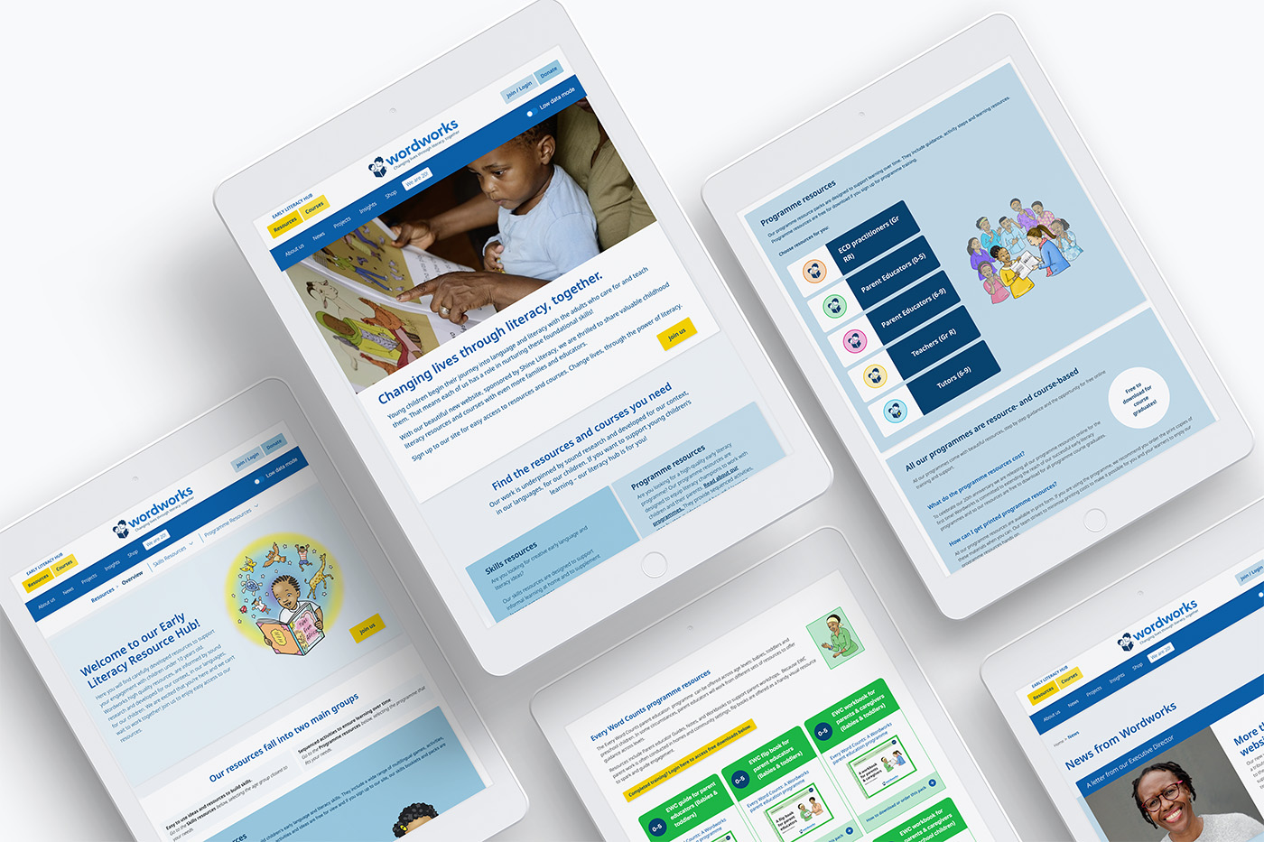
Wordworks Website Design
Client: Wordworks
Project lead & client management: Matogen Digital
Design: Unfold
Website development: Matogen Digital
Wordworks is a South African literacy organisation dedicated to strengthening early language and literacy development. They work with teachers, caregivers and communities to support young children’s learning through practical programmes, training and high-quality learning materials.
As a small, close-knit team, Wordworks needed a streamlined platform that could bring several functions together in one place. The site needed to offer downloadable resources, an online shop for learning materials, course sign-ups, and space to share news and events, all within a system that was simple for the team to manage.
A closing gift from Shine Literacy
Shine Literacy closed its doors in March 2024 after 23 years of supporting early reading and writing programmes. The organisation’s leadership recognised that continuing as a non-profit was no longer the most effective way to achieve their mission of building confident readers. Instead, Shine chose to invest its remaining resources in trusted partners such as Wordworks and to open-source its training and learning materials, allowing their impact to continue through others.
For Wordworks, this support helped fund the development of a new website that strengthens key operational systems and improves how they share their work and impact.
First step: a light but needed logo refresh
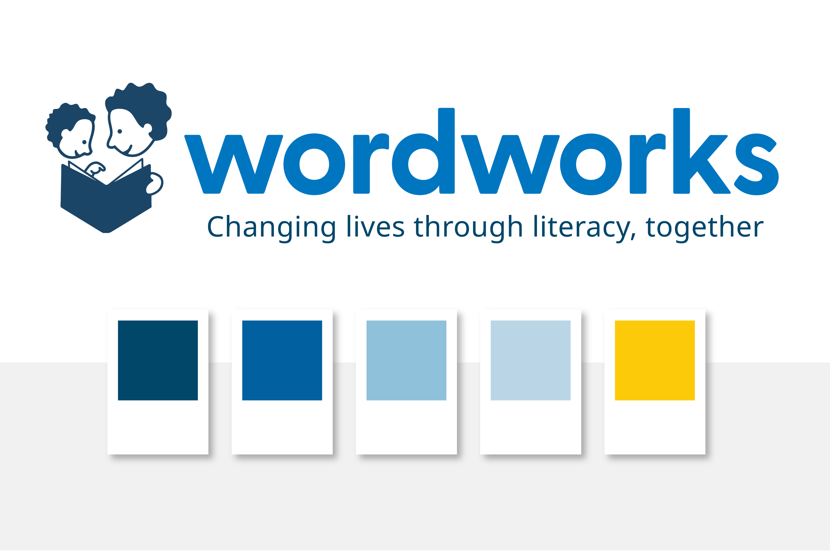
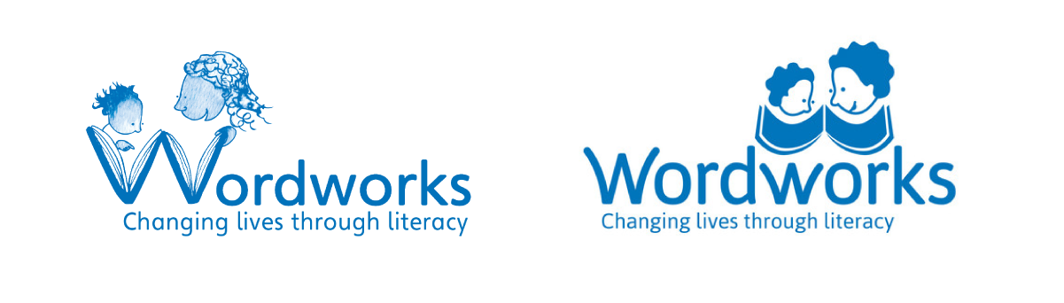
We modernised the Wordworks logo by introducing a bold, clean sans-serif typeface, giving it a more contemporary and confident feel while carefully preserving the two characters from the legacy logo. The refreshed design balances clarity and warmth, keeping the recognisable personality of Wordworks intact while making the brand more versatile and easier to read across digital and print platforms.
Font
We chose Nunito Sans for its friendly, highly legible letterforms that perform well on mobile and support clear, accessible reading across the site. Its wide range of weights creates a strong visual hierarchy, while its extensive glyph set supports multiple languages and special characters, making it well-suited for a global and inclusive audience.
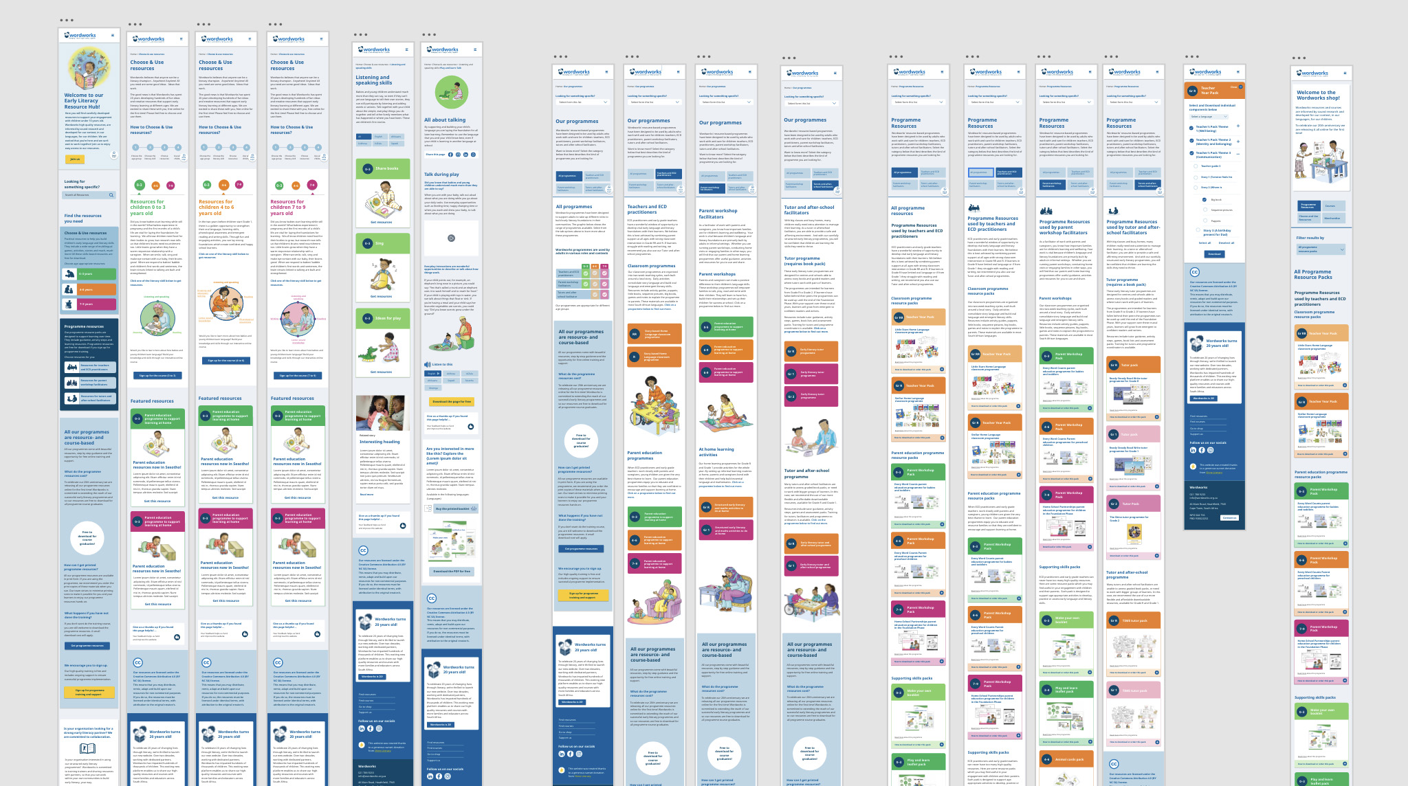
Mobile-First Prototype Design
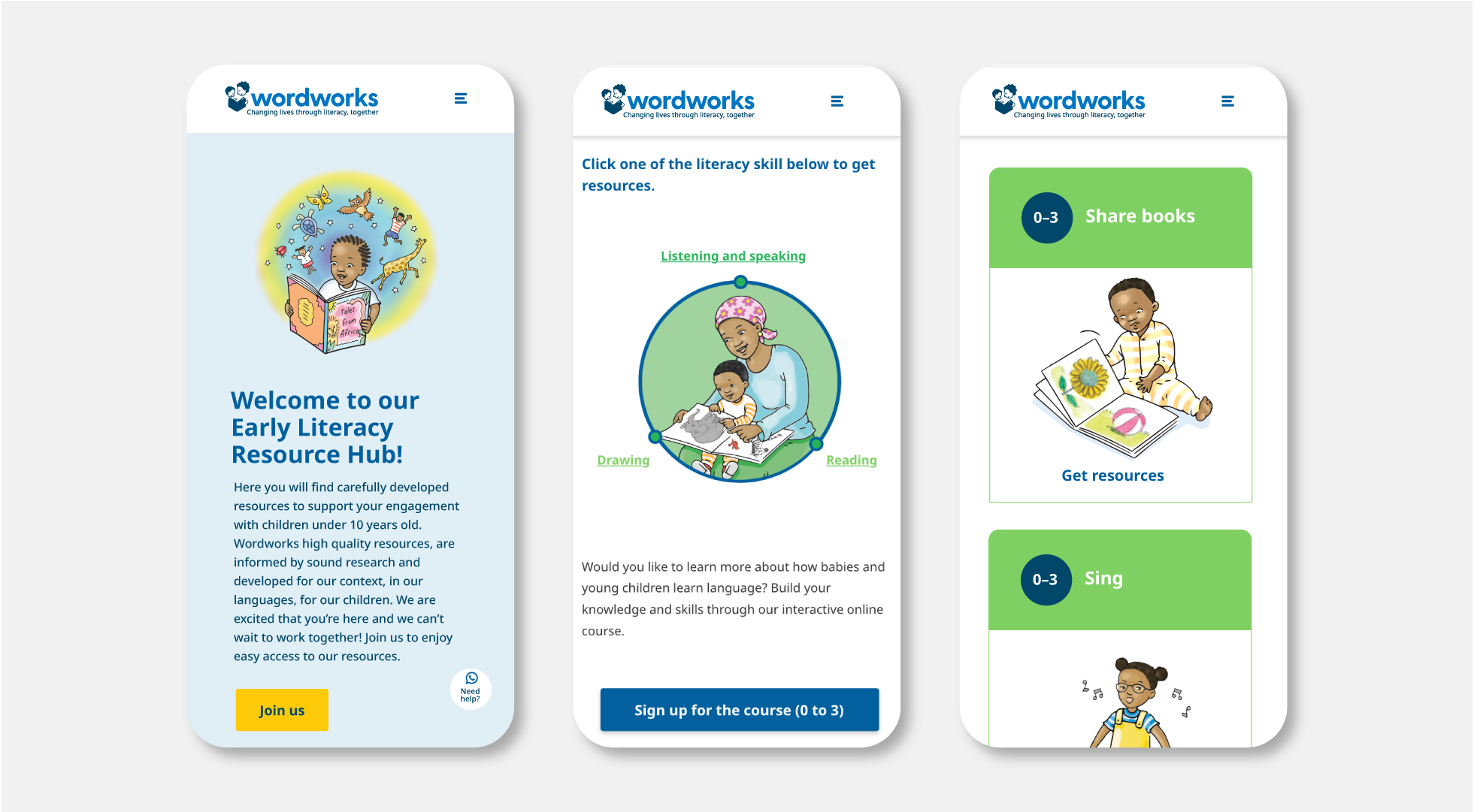
Recognising that many Wordworks partners and caregivers access content primarily on mobile devices, we adopted a mobile-first design approach. The site is intentionally lightweight and optimised for fast loading, with low data use in mind for rural and low-connectivity settings. A clean, intuitive interface makes it easy to find resources, programmes, and updates. Mobile and desktop prototypes were developed to give the team a realistic preview of the final user experience.
Website features
- Resource page with filtering options
- Online resource shop
- Online courses (LearnDash platform)
- Site-wide low data mode
- Site-wide WhatsApp support
- User and team leader logins with dashboards
- Shop integration
Working Collaboratively
We worked closely with Wordworks’ communications designer and the design thinkers already on the team. Through online whiteboards and shared prototype files, we planned user flows with real-time input from Wordworks and our development partner, Matogen Digital.
We transformed a dense, multi-layered resource library into a seamless, user-friendly experience. Through thoughtful navigation, clear content organisation, and intuitive pathways, we made it easy for educators, parents, and learners to find what they need. A standout feature is an interactive infographic that allows users to browse resources by skill, offering a visual way to identify focus areas.
The result is a website where rich educational content is accessible, logically organised, and engaging, turning complexity into clarity.
Outcome
The new Wordworks website provides a modern, accessible, and efficient platform for teachers, caregivers, and communities. It balances contemporary design with practical functionality, making resources and updates easy to access, even in low-connectivity rural settings. The refreshed branding and mobile-first approach strengthen Wordworks’ digital presence, helping the organisation reach more learners and partners.